Marketplace Pulse: Volatility in the Individual Market
The Marketplace Pulse series provides expert insights on timely policy topics related to the health insurance marketplaces. The series, authored by RWJF Senior Policy Adviser Katherine Hempstead, analyzes changes in the individual market; shifting carrier trends; nationwide insurance data; and more to help states, researchers, and policymakers better understand the pulse of the marketplace.
The individual market has been defined by its instability. Our long look last month revealed patterns of participation which featured mass carrier exits in 2017 and 2018, leaving many counties with only one insurer by 2018. This exodus has been followed by a gradual return to the market in 2019 and 2020. Yet this pattern has not been the same everywhere. Some counties have had fairly stable participation in the individual market from the outset, while the experience in other counties has been characterized by wild swings.
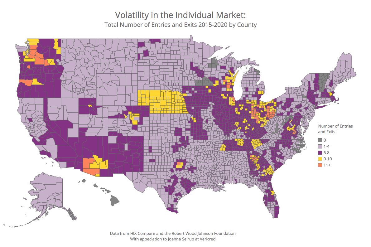
We measured each county's level of carrier change by adding up all exits and entries that occurred between 2015 and 2020. Almost all counties had at least some change. About half of had fewer than five carrier changes, and about three-quarters had less than seven. The top 10 percent of counties had nine or more carrier changes, and a very small number of counties—54 (about 2%)—had more than 10 carrier exits and entries. In all categories with some amount of change, there was a net loss of carriers.
No change
Only a few counties (about 2%), had no change at all. These counties were in eight states, and included some very rural places. A little under half had only one carrier for all 5 years, and almost all of the rest had two carriers. In all of these counties, the same carriers participated in the individual market for the entire period.
Moderate change
A little more than half of counties had between one and four carrier changes. There were more exits than entries, so these counties were net losers over time. Their mean number of carriers, which was 3.3 in 2015, fell to about 2.0 by 2020.
About a third of counties had between five and eight carrier changes. These counties also lost carriers over time, on a somewhat larger scale, with the average number declining from about 4.5 in 2015 to 2.4 in 2020. About three-quarters of these counties had only one or two carriers by 2020.
Lots of change
The top 10 percent of counties had nine or more changes, and lost carriers over time—with a decline in the average number from 5.3 in 2015 to 3.0 in 2020. A very small group—54 counties—had 11 or more carrier changes. These counties are in nine states and include metro areas such as Chicago, Richmond, and Atlanta. About half (28 counties), are in largely non-metropolitan areas of Ohio.
As an extreme example, Maricopa County, Arizona (which contains the city of Phoenix) had 16 carrier changes between 2015 and 2020, the most of any county. Four national commercial carriers sold plans there in 2015, in addition to Blue Cross Blue Shield, an MMCO, a co-op, and others. There were 11 plans in total on the exchange in that year. In 2016, Maricopa County had eight carriers, but by 2017 only one remained. In 2020 there will be five. Less dramatic but somewhat similar is the experience of Barrow County, Georgia, in the Atlanta area, which dropped from nine carriers in 2015 to two in 2018, and has remained with two. Chicago (Cook County) had eight issuers in 2016, including both a co-op and a start-up. The next year they had three, which remains the case. (The participation history of any county can be explored with our interactive tracker.)
Co-ops figure largely in the history of volatile counties. In fact, nearly three-quarters of those with nine or more carrier changes had a co-op in their market in 2015. Overall, co-ops were present in less than 40 percent of all counties in 2015. They were in about half of those with five to eight changes, and approximately one-quarter of those with one to four changes.
Counties with many carrier changes may have had an excessive level of participation at the outset, suggesting that they had characteristics that made them attractive to plans. This may have resulted in underpricing and subsequent exits. It appears that many are still relatively desirable to carriers. Maricopa County, for example, has seen recent entry from Oscar and Bright Health. Their appeal may reflect factors such as population growth, high rates of uninsured and self-employment, desirable provider networks, and Medicare Advantage market considerations. Data from the HCCI Healthy Marketplace Index suggests that many of these counties are in metro areas with below average measures of hospital concentration, which could make them more attractive to health plans. Most high volatility counties are in states that use the healthcare.gov platform, suggesting that some state plan management factors may also have been relevant.
Carriers and state regulators everywhere have learned a lot since 2015, sometimes the hard way, and in recent years there has been more stability. With participation gradually increasing for a second year, it remains to be seen whether volatility in the individual market is a thing of the past.

Related Content

Marketplace Pulse: A Long Look at the Individual Market

Marketplace Shifts as National Carriers Withdraw
